
It's 3 a.m. Your terminal is pitch black, your IDE is somehow blacker, and you are deep in the zone. Then you click a legacy documentation link and a 100% luminance white page flashbangs your retinas. You squint, curse the frontend team, and swear a sacred oath: never light mode again.
82% of smartphone users have dark mode enabled. That is not a trend; that is a denomination. But here is the rude truth nobody at the local hackerspace wants to admit: most peer-reviewed research is on light mode's side.
Stick around. Receipts included.
TL;DR for the scrollers
- Light mode wins on visual performance for people with normal vision, and the advantage grows as fonts get smaller.
- Battery savings from dark mode are wildly overstated. They only matter on OLED, and collapse the moment you turn brightness down.
- Roughly a third of adults have astigmatism, and for many of them dark mode actively makes text worse.
- Dark mode may protect against long-term nearsightedness. Very small study, but a real finding.
- The honest reason most of us use it: it looks fantastic. That is a legitimate reason. Stop pretending it is a medical decision.
Still here? Good.
A short, smug history lesson
Dark mode is not new. Dark mode is ancient.
The original CRTs were green-on-black or amber-on-black because that is simply how phosphors work — they glow. For three decades, every serious computer user stared into a literal void with luminous characters floating in it. Then the WIMP revolution happened, marketing departments discovered Helvetica, and suddenly we were all supposed to use computers that looked like printed memos. Apple shipped system-wide dark mode in iOS 13 in 2019, the normies finally got the memo, and welcome to the basement, friends. We have stickers.
The science: light mode actually wins
Here is the part where I have to break the bad news.
The most-cited study, Piepenbrock et al. (2013, Ergonomics), tested younger and older adults on proofreading and visual-acuity tasks under both polarities. Light mode won in both age groups. The follow-up in Human Factors found the gap gets wider as fonts get smaller. Your tiny 11px monospace setup? Your retinas are filing a ticket.
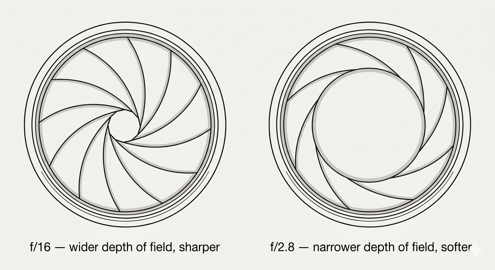
Why? Think of your eye as a DSLR.
- More ambient light, and the pupil constricts (smaller aperture)
- Smaller aperture means a wider depth of field
- Wider depth of field means less focusing strain, sharper text
Your eyeball wants f/16, not f/2.8. The Nielsen Norman Group's literature review walks through the canon and concludes, with palpable reluctance, that light mode wins most of the time for normal-vision users.
And before you blame light mode for that headache: the American Academy of Ophthalmology's official advice basically amounts to blink more, take breaks. That is it. The eye strain you have been blaming on white pages is mostly not blinking enough, brightness mismatch with the room, and ignoring the 20-20-20 rule.
Sorry. Don't shoot the messenger.
Plot twist: dark mode might save your eyes long-term
Before you uninstall this blog from your brain, here is the vindication scrap.
A 2018 study in Scientific Reports measured choroidal thickness — a proxy for myopia risk — before and after an hour of reading in each mode.
- Light mode: choroid thinned by about 16 micrometres (associated with developing nearsightedness)
- Dark mode: choroid thickened by about 10 micrometres (the good direction)
Caveat that we are putting in bold because it matters: the sample was seven humans. Do not put this on a billboard. But the hypothesis is plausible and follow-up work is underway. Light mode may be the high-interest credit card of vision — fine today, possibly nasty bill in twenty years.
Science is doing its best. Please clap.
The battery lie we all tell ourselves
You: "I use dark mode to save battery."
Your phone: "Mate, you have an LCD."
Dark mode only saves real power on OLED and AMOLED screens, where individual pixels switch off for true black. On LCD the backlight is on regardless; dark mode saves you precisely zero joules. It just makes you feel like a hacker.
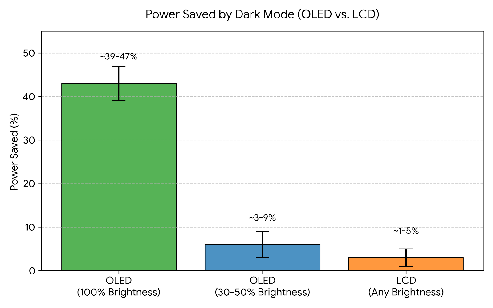
Even on OLED, the Purdue University study (Dash & Hu, 2021) found the savings collapse with brightness:
| Screen | Brightness | Power saved |
|---|---|---|
| OLED | 100% | ~39–47% |
| OLED | 30–50% (typical indoor) | ~3–9% |
| LCD | Any | ~1–5% |
The kicker: most people crank brightness up in dark mode so they can actually read it. That cancels most of the saving. Dark-mode battery economics is the perpetual-motion machine of UX — looks great on paper, breaks the moment a human touches it.
One genuine silver lining from the same study: light mode at 20% brightness draws roughly the same power as dark mode at 50%. If light mode strains your eyes only because it is too bright, dim it. You will not nuke your battery.
The astigmatism revenge arc
Now for the betrayal hiding in plain sight.
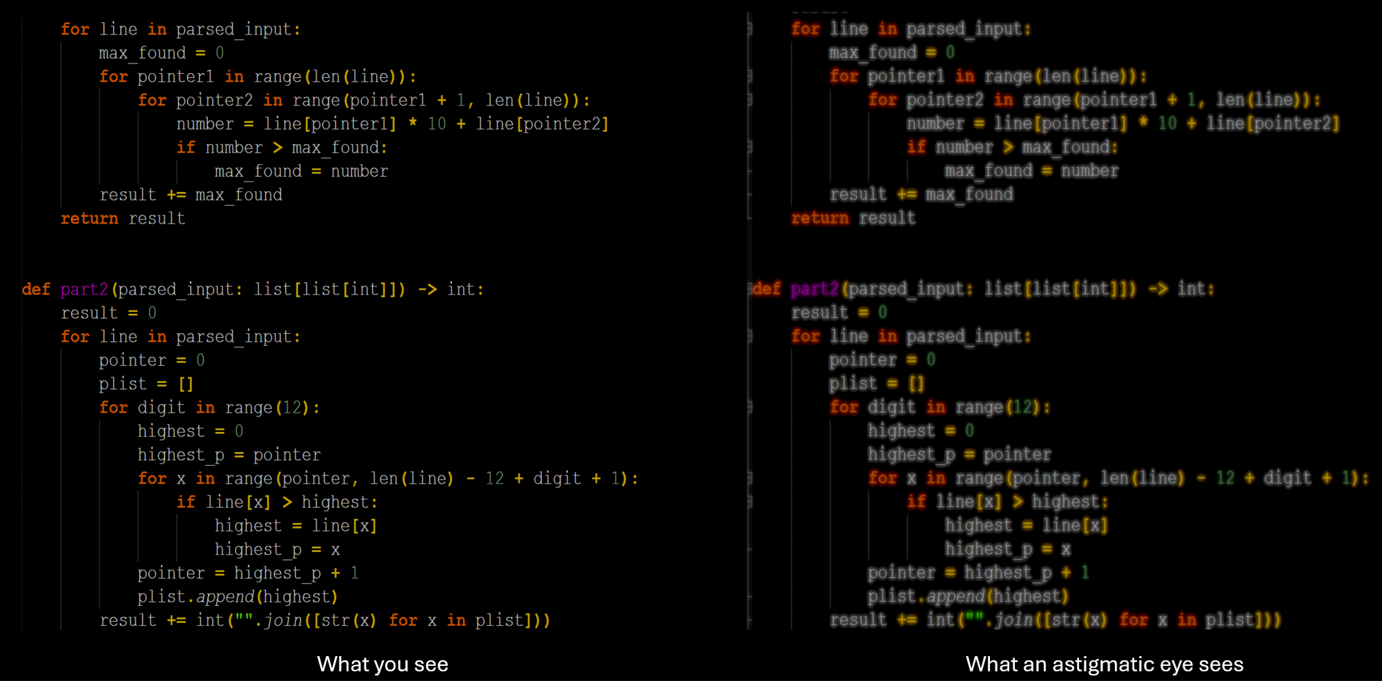
Roughly 30–50% of adults have some degree of astigmatism. For many of them, dark mode actively makes text worse. The phenomenon is called halation: bright text on a dark background appears to glow, bleed, or shimmer at the edges.
The optical reason is annoyingly logical:
- Dark surround makes the pupil dilate
- A bigger pupil lets light enter through the irregular periphery of an astigmatic cornea
- Result: glowing edges, smeared characters, gently vibrating text at 3 a.m.
If your monospace font has ever looked vaguely shimmery in dark mode and you assumed it was just sleep deprivation — surprise. It might be your corneas filing a complaint. Samantha Cole's 2019 Vice piece was the first mainstream callout, and a quiet exodus to dimmed light mode has been going on ever since.
Try this: a week of light mode at low brightness. Worst case, you confirm dark mode was right all along. Best case, your headaches drop and you owe a Windows user an apology.
So why do we really do it?
Let's be honest with each other.
NN/G's 2023 user research surveyed mobile users and found a near-perfect split: a third dark, a third light, a third "it depends." When they asked dark-mode fans why, the answers clustered around four reasons:
- "My eyes feel better." Sometimes true, often vibes.
- "It saves battery." See above; mostly fiction.
- Genuine accessibility need. Real and well-evidenced for cataracts and other cloudy ocular media (Legge et al., 1985). For these users, dark mode is not aesthetic — it is essential.
- "It just looks cooler." This is the honest one.
There is even a name for the bias powering this: the aesthetic-usability effect. Pretty things feel easier to use whether or not they actually are.
Your dotfiles are public on GitHub for a reason. Your terminal prompt has a Nerd Font glyph. You chose Gruvbox over Solarized after a forty-minute existential crisis. This is who we are. It is beautiful. Just stop pretending it is a clinical decision.
What to actually do
If you read one section, read this one.
| Situation | Use |
|---|---|
| Dim room, evening | Dark mode |
| Sunlit room, daytime | Light mode |
| Long focused reading | Lean light |
| Doomscrolling, streaming, coding at night | Lean dark |
| You have astigmatism or see "glow" on text | Try low-brightness light mode for a week |
Universal rules, ranked by how much they actually matter:
- Match screen brightness to ambient light. This is bigger than your colour scheme. By a lot.
- 20-20-20 rule. Every 20 minutes, look at something about 6 metres away for 20 seconds.
- Blink, on purpose. You blink roughly half as often when staring at a screen. Dry eyes are 90% of what people call "eye strain."
- Take real breaks. No theme war fixes the fact that you have been staring at a monitor for eleven hours.
The verdict
Dark mode will not save your eyes.
Dark mode will not save your battery.
Dark mode will not save your soul.
It is a vibe. A genuinely, deeply good vibe. And in a world full of screaming white SaaS dashboards, that is reason enough.
So enable it. Or don't. Match it to the room. Adjust the brightness. Take breaks. Stop fighting about it on Hacker News.
Now if you'll excuse me, I have a Gruvbox theme to tweak.
Receipts
- Budiu, R. (2020). Dark Mode vs. Light Mode: Which Is Better? — Nielsen Norman Group
- Kohler, T. & Zhang, A. (2023). Dark Mode: How Users Think About It — Nielsen Norman Group
- Piepenbrock, C. et al. (2013). Positive Display Polarity Is Advantageous — Ergonomics
- Aleman, A., Wang, M. & Schaeffel, F. (2018). Reading and Myopia: Contrast Polarity Matters — Scientific Reports
- Cole, S. (2019). Dark Mode Isn't "Easier on the Eyes" for Everybody — Vice
- Dash, P. & Hu, Y. C. (2021). Shedding Light on Dark Mode to Save Energy — Purdue Engineering
- American Academy of Ophthalmology — Digital Devices and Your Eyes